
Is bigger better?
We live in a world where BIGGER IS BETTER, or at least it seems to be, right?
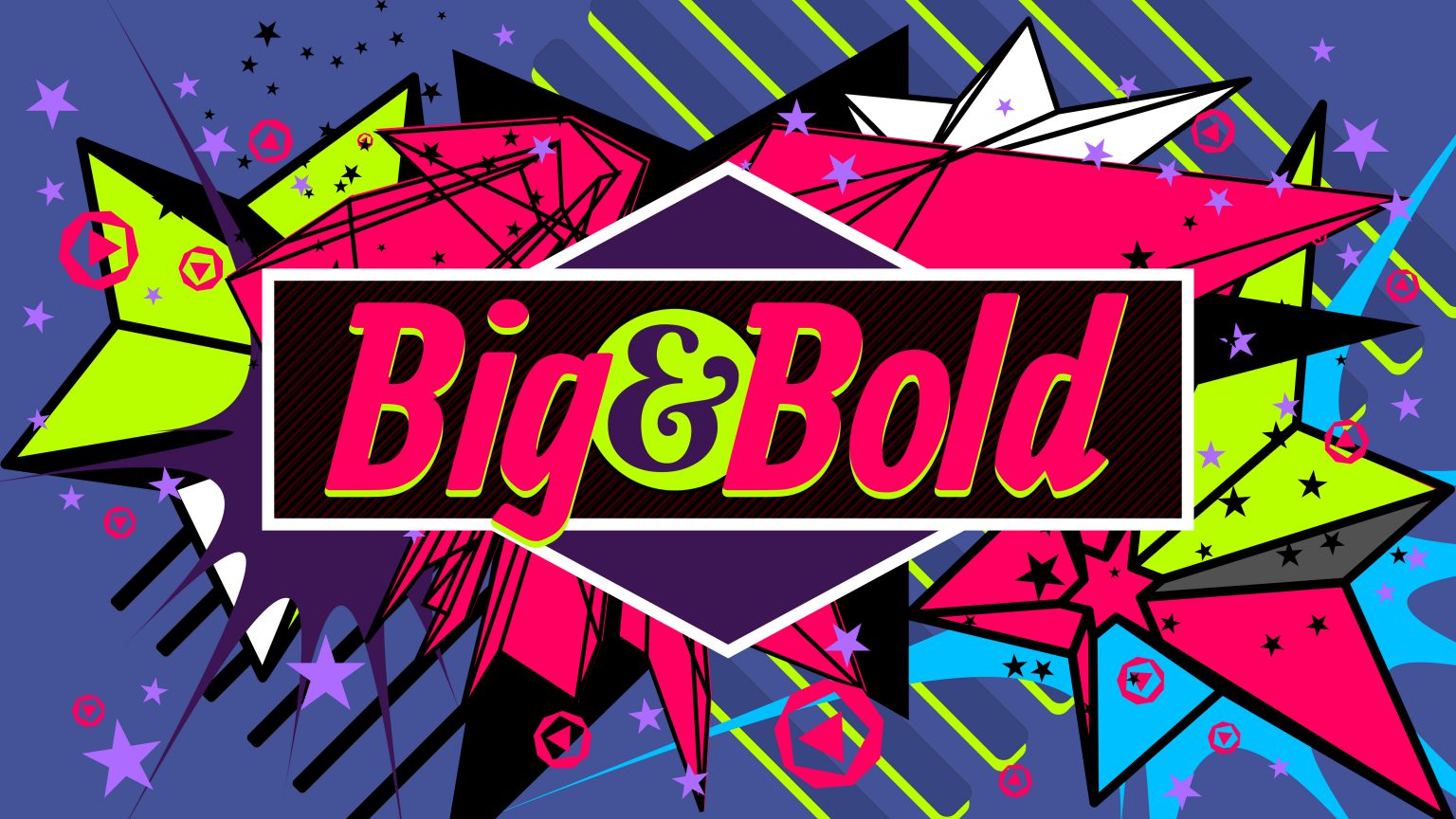
At Project Content, we tend to follow the philosophy around digital content that less is more, and that its more beneficial when designing content for your sign to follow patterns of fewer words, fewer lines of text, along with big, bold text that is easy for the audience to read.
While this best practice may seem like common knowledge, you’d be surprised how much of it isn’t. We see many sign software platforms and design software that presents users with enough font choices and design applications to make your head spin. We’ll let you in on a little secret that you’ll probably use less than ten percent of the fonts and design tools that most solutions offer-and that’s ok.
You will use less than 5% of all fonts available to you.
Our design team consists of four graphic designers that spend most of their days creating designs specific for digital signs. Collectively, they have about 40 years of experience and have spent lots of time in various design applications, developing a great taste and opinion of what looks best. Hands down, our team prefers Impact, Cooper and Verdana-Bold fonts. These fonts create distinguishing designs, have good separation between lettering so your message is easy to read, and follow the consistency associated with digital signage best practices.
With bigger, bolder text always comes the question of how much information or text to include on your content designs. We find that no more than 3 lines of text/slide with no more than 6 words/slide tend to be a best practice. Big and bold text as opposed to small, thin, hard-to-read text wins the day around any piece of quality content.
While you may feel that following these recommendations will leave your audience wanting more, resist the urge to be overly detailed. Remember, depending on your location, you could have thousands of cars passing by your sign each day. Factors like sign location, car count, car speed, whether people are walking or driving by (probably both) will affect how much information they can process and how much time they have to process your message as they pass the sign. In the world of digital signage and content creation, bigger is better and less is more.
To close, on top of our “Big & Bold” and “Less is More” mantras, we recommend providing some contrasting colors as part of your design. Dark backgrounds with light-colored lettering provide the perfect contrast to help get your message across and really allow big, bold lettering to pop.
Have more questions?
If you’re looking for suggestions, don’t hesitate to hit us up. Our website and content library are full of suggestions and examples that follow our recommendations, and we’re always a quick phone call or email away from answering any questions sign owners have.
Designing digital content can be super-fun when done the right way. Like any talent or skill, it takes time to develop a knack for creating designs that look great and we’re here to support you every step of the way!