

Here’s a quick question for you
Spoiler Alert: They’re Massive
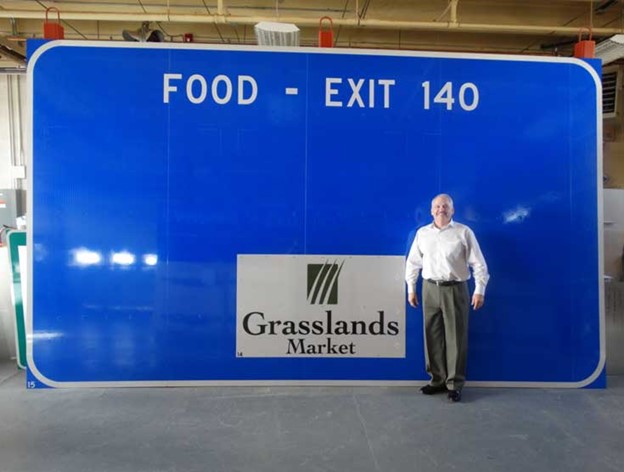
Each of those rectangular logos is three feet tall by four feet wide.
That’s bigger than most front doors. Surprised? You’re not alone.
At highway speeds, our eyes compress visual information. What feels “small” from the car window is actually huge in real life. It’s a perfect example of how distance and speed affect readability—and it directly relates to your digital signage strategy.
Speed + Distance = Design Rules
The lesson? If your LED sign is visible from a road or highway, the content you put on that sign needs to account for two major factors:
-
How far away viewers are from your sign
-
How fast they’re moving when they see it
What looks great on your computer screen might be impossible to read at 45 mph. Tiny text, too much clutter, or overly detailed graphics won’t register at a glance—they’ll just blur into the background.
That’s why Project Content emphasizes smart, intentional content design. Our content templates and custom design services prioritize clarity, impact, and timing—because your audience often has just seconds to absorb your message.
Design with Visibility in Mind
Here are a few quick best practices drawn from real-world visibility tests:
-
Use large, bold fonts with high contrast.
-
Stick to short messages—ideally seven words or fewer.
-
Avoid clutter. One strong message works better than several small ones.
-
Keep logos large and centered for quick recognition.
-
Use motion sparingly and only when it enhances clarity.
Your digital sign competes with traffic, landscape, and weather. You can’t afford to make people squint. You have to make your message clear instantly.
Want to Get It Right? Download the Project Content Playbook
We created the Project Content Playbook to help businesses like yours take the guesswork out of digital sign design. It’s packed with practical tips, visual examples, and strategic guidance based on real-world signage performance.
Whether your sign sits on a bustling highway or a quiet two-lane street, the Playbook breaks down what works—and what doesn’t—so you can build a content strategy that actually performs.
Oh, and did we mention? It’s completely free.
Download the Playbook here and start turning drive-by traffic into real engagement.