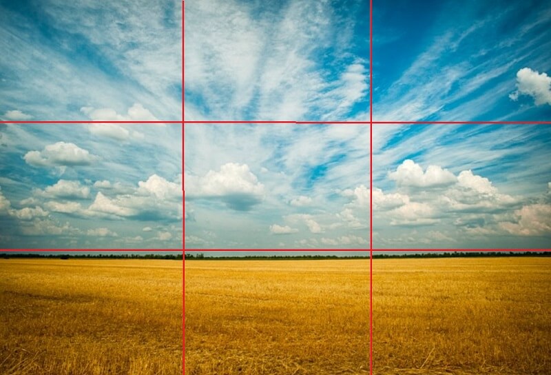
The Rule of Thirds
The Rule of Three (maybe you’ve heard of this one too)……If I have a bad experience, I’m going to tell three people about it, and they’ll tell three people, and they’ll tell three people, and so on, and so on….Eventually the bad experience spreads like the plague.
This might be a Rule of Three, but when it comes to design, this rule isn’t quite the same.
While our goal with this post isn’t to twist the knife further with more rules, there are many important rules to keep in mind when it comes to being a business owner, investing in digital signage, and making sure your digital content is optimized for being noticed by as many people as possible. With this in mind, we decided to devote some time to best practices around digital content and The Rule of Thirds.
Most digital content is going to be a combination of pictures and words. The picture could be a background with text overlaid on top, it could be a picture on one slide, followed by words on another, or it could be one slide consisting of both. Most digital signs are either rectangular or square in shape, following common aspect ratios like 2:1, 1:2, 3:1, 1:3, 4:1, or 1:4. These common shapes and ratios create a surface area that must be split proportionately between pictures and texts, following some best practices to make sure your content will look right on them.
The Rule of Thirds for digital signage is pretty simple. It basically states that when combining pictures and text on the screen in a way in which they won’t overlay, but be next to each other, that you envision splitting the screen into thirds when thinking about how to position things. Consider devoting 1/3 of the screen to your picture/graphic, and 2/3’s of the screen space to your message. This best practice is especially true for rectangular shaped signs, and we see it mostly practiced and recommend it most often when considering this shape of a sign.
While this may seem like common knowledge to many sign owners, we often see the inverse, where the picture or graphic will take up the majority of the space, with the text shrunk down so small, it’s impossible to read. Remember, messages and text in general should be simple and succinct.
The fewer words, the better.
Finally, when putting the Rule of Thirds into practice, make sure that if you’re working with a rectangular sign, that you’re not applying the rule from top to bottom. Only apply the rule from left to right. In other words, you don’t want an image taking up the top 1/3 of your sign, with the message taking up the bottom 2/3’s. This will shrink everything and make your sign look terrible.
While signs and rules will always be a part of our world, there’s nothing wrong with having a little fun with them and using both to our benefit. If you ever have questions about signage best-practices or want a second opinion on a piece of content you’ve designed, Project Content is happy to help!

