High Contrast
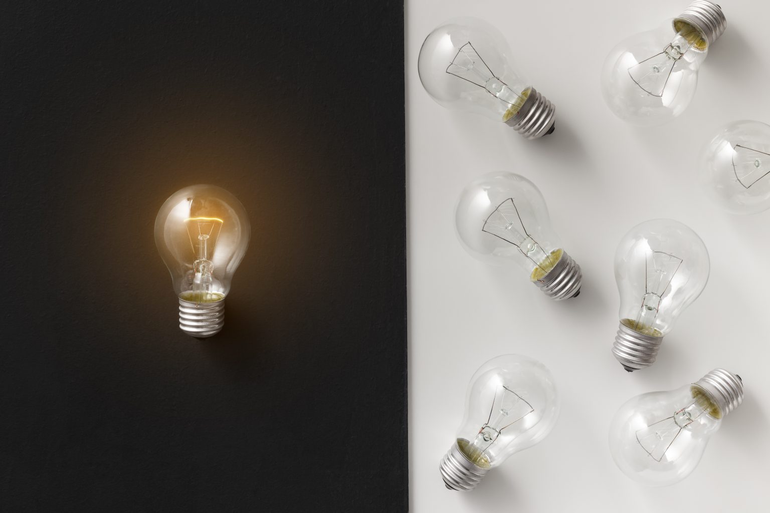
Contrast is a measure of the difference in perceived “luminance” or brightness between two colors. The higher the contrast, the more visible & eye-catching colors will be together. Having high contrast for text, logos, & directional symbols on signs is critical for readability at a distance.
Contrast is Key!
White and black have the highest contrast, having the lightest and darkest values respectively. White on black, or the reverse, are great standard options for signage. Black and yellow together is another popular high contrast pair.

Opposite color pairs (diagonal on the color wheel) typically have high contrast if their values are different. Purple and yellow are a good example of this. Purple is naturally a dark value, and yellow is a light value, so these opposite colors have high contrast & high visibility. Harmonious colors similar in value, like green and blue, have low contrast & low visibility.
It’s also possible to choose colors that are close together on the color wheel (harmonious colors) and create contrast with different values. Experiment with the values of colors to see what gives you the most contrast. As a result, you can create a harmonious color pair with high contrast.

